A strong, unified, and recognisable Government agency rebrand for the Gippsland Lakes 'Love Our Lakes' program
A strategic healthcare and aged care brand transformation to help Country Care Group put the care back in our country
Client
Country Care Group
Services
Brand Identity | Brand Communications | Brand Guidelines | Brand Voice / Copywriting | Logos | Illustration | Advertising | Catalogues | eBooks | Corporate Collateral | Marketing Collateral | Point of Sale | Packaging | Posters | Stationery | Signage | Print Management
Project Information
Background
Country Care Group Founder, Rob Hogan, was looking to transform and expand his family-owned business but he could see the existing brand didn’t align with his aspirations and growth targets. VSD Creative was engaged to help solve this branding problem.
Key rebranding goals were to elevate market position, increase general brand awareness and create a brand that current and new retail consumers, businesses and Government agencies could be proud to partner with. The rebrand needed to help attract new talent to the organisation and be something that current staff were proud to be a part of.
Challenge
Country Care Group faced the following challenges in their journey to elevate their brand. Firstly, their existing brand logo was not unique, memorable or innovative. Predominantly, the brand logo was a generic map of Australia and this didn’t convey their mission to ‘Empower people to improve their everyday lives through innovative healthcare solutions’. Secondly, the focus of the brand was on disability products, this narrowed their perceived product and service offering and would hinder the business expansion. Lastly, the existing brand lacked the professionalism required to engage Government agencies, win major contracts and attract new talent to the organisation.
Solution
Our Brand Vision Discovery found that Country Care Group wanted to be recognised as the only business of choice for quality and innovative healthcare solutions, products and services nation-wide. Country Care Group was growing into a full-service provider that was also capable of handling large Government contracts.
Brand strategy was our initial priority, we suggested simplifying the name by removing “The.” The tagline ‘National Distribution, Local Service’ was deemed important to the future expansion and was retained.
The newly developed brand icon was informed by our research and insights. During the period where the existing brand logo had been used, the generic ’Australia Map’ had developed a degree of recognition and brand equity, it was to be retained, but unfortunately it wasn’t unique and didn’t convey ‘innovation’. Ultimately, the icon was inspired by an off-handed statement: ‘we want to put the care back in our country’. ‘Care’ is universally inferred by the use of the ‘heart’, we embedded that element into the icon, creating an ‘Australia’ icon unique to Country Care Group which symbolised ‘Country’ and ‘Care’.
For the wordmark, we chose a clean and modern sans-serif font with a tall x-height. This created a more contemporary look and enhanced readability across printed and digital touchpoints.
The brand rollout consisted of various brand applications. We designed brand guidelines, corporate stationery and collateral, catalogues, storefront signage, in-store signage, expo signage, press advertising, point-of-sale collateral, merchandise, packaging and uniforms.
Results
The rebrand has assisted Country Care Group with their exponential expansion from a localised store structure to a national brand. In 2022, the organisation and brand was viewed favourably by a large equity partner and Country Care Group is now expanding rapidly nation-wide.


A series of brand icons were created to signify key product categories. These icons were used in printed collateral and in-store signage to assist customers with locating products.


Store front and vehicle signage was also developed. Key brand elements and messaging were carefully considered and sized to maintain maximum consistency across varied structure and vehicle types.


discover more projects
Sports club rebrand for a friendly, community-focussed regional tennis club in Victoria
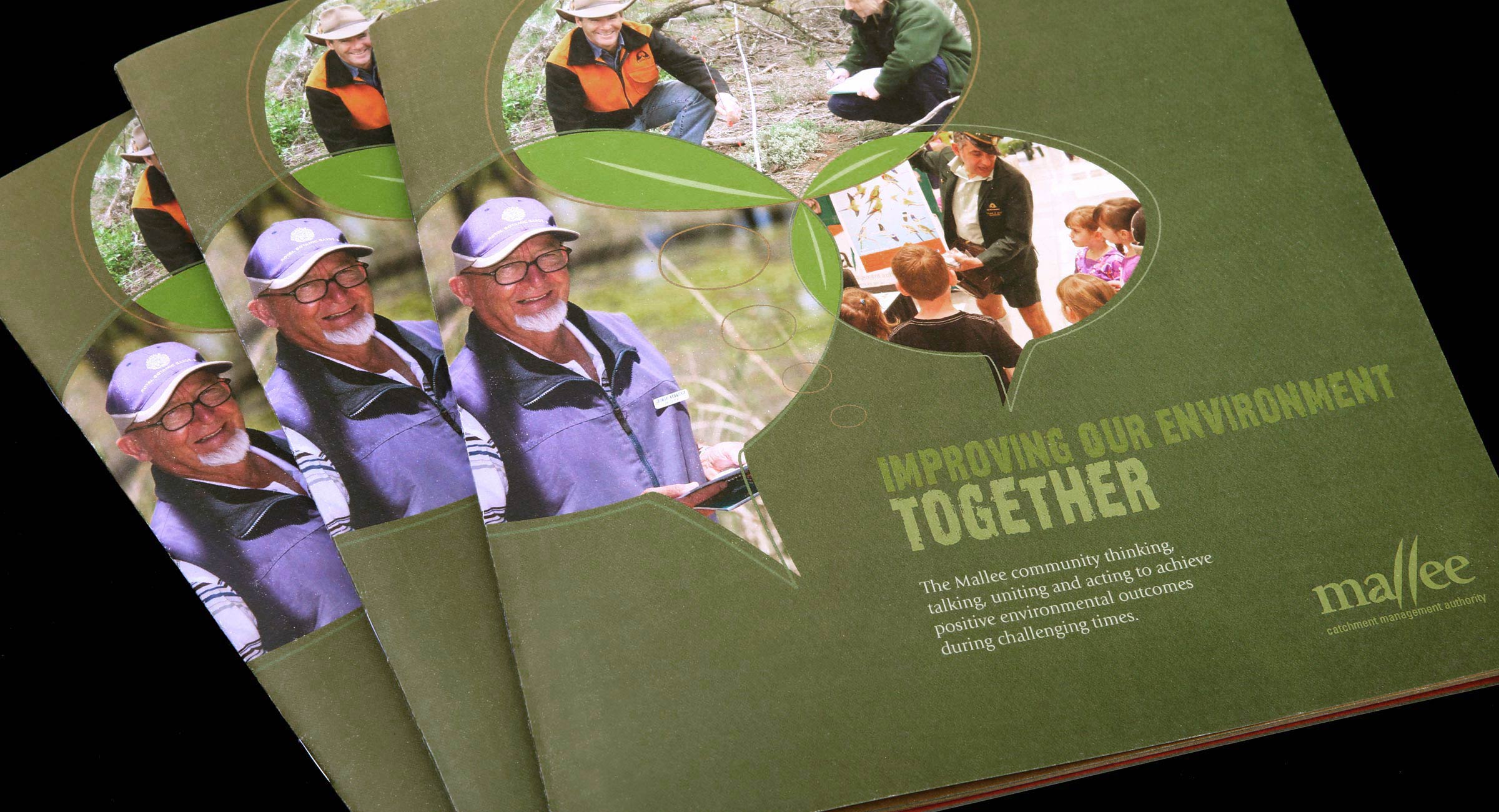
Catchment management authority branding - creating cohesion, clarity, connection, and impact across East Gippsland CMA's corporate communications
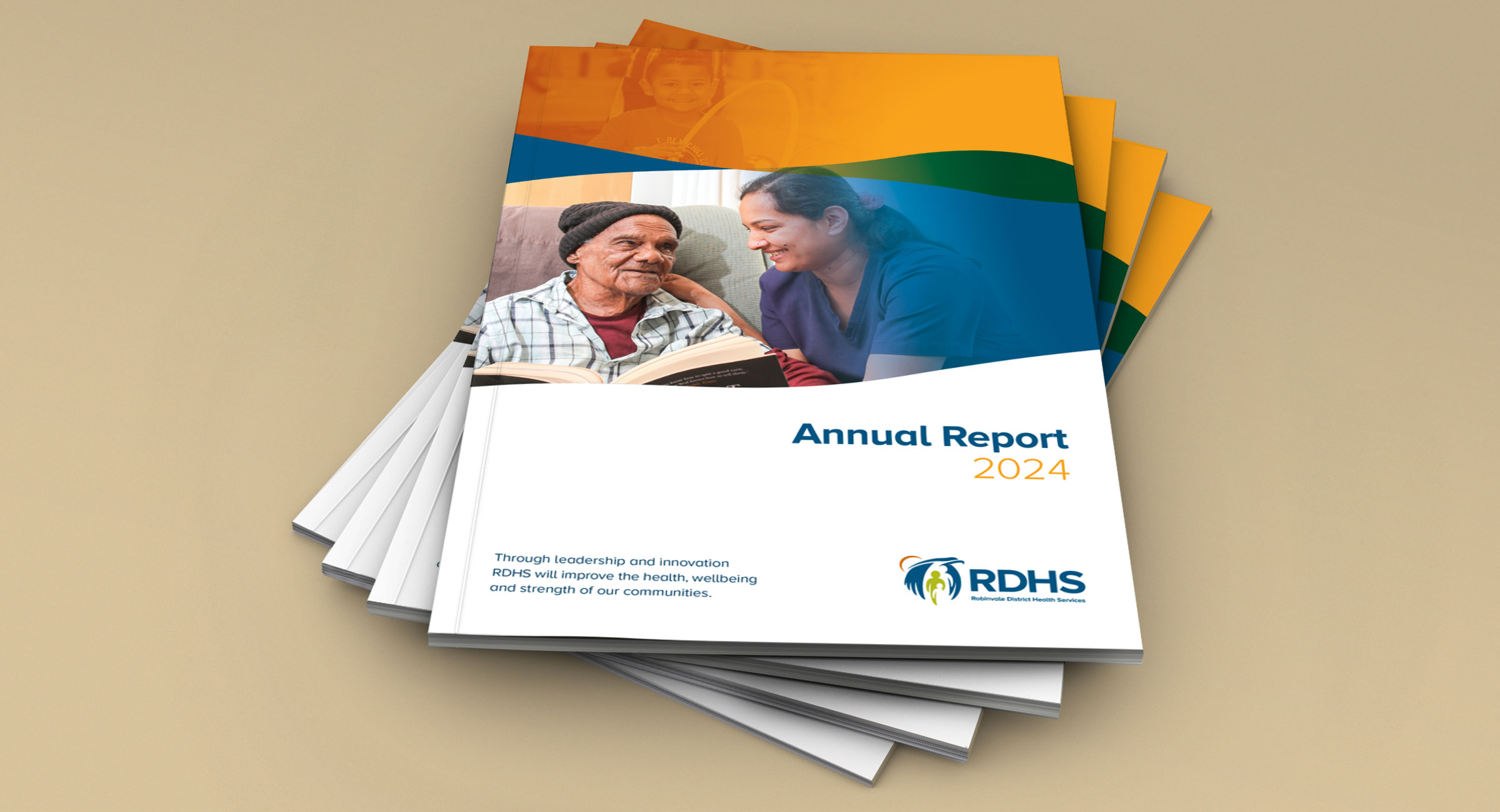
'Taking care' of reporting - healthcare annual report design for Robinvale District Health Services
A brand helping to foster strong relationships and quality outcomes for water and natural resources projects
Adding polish to an established Sydney floor sanding and finishing company

Educational activity book encouraging school-aged children to engage, learn, discover and explore the environment

Corporate branding for Greenline, an industry-leading shade structure specialist
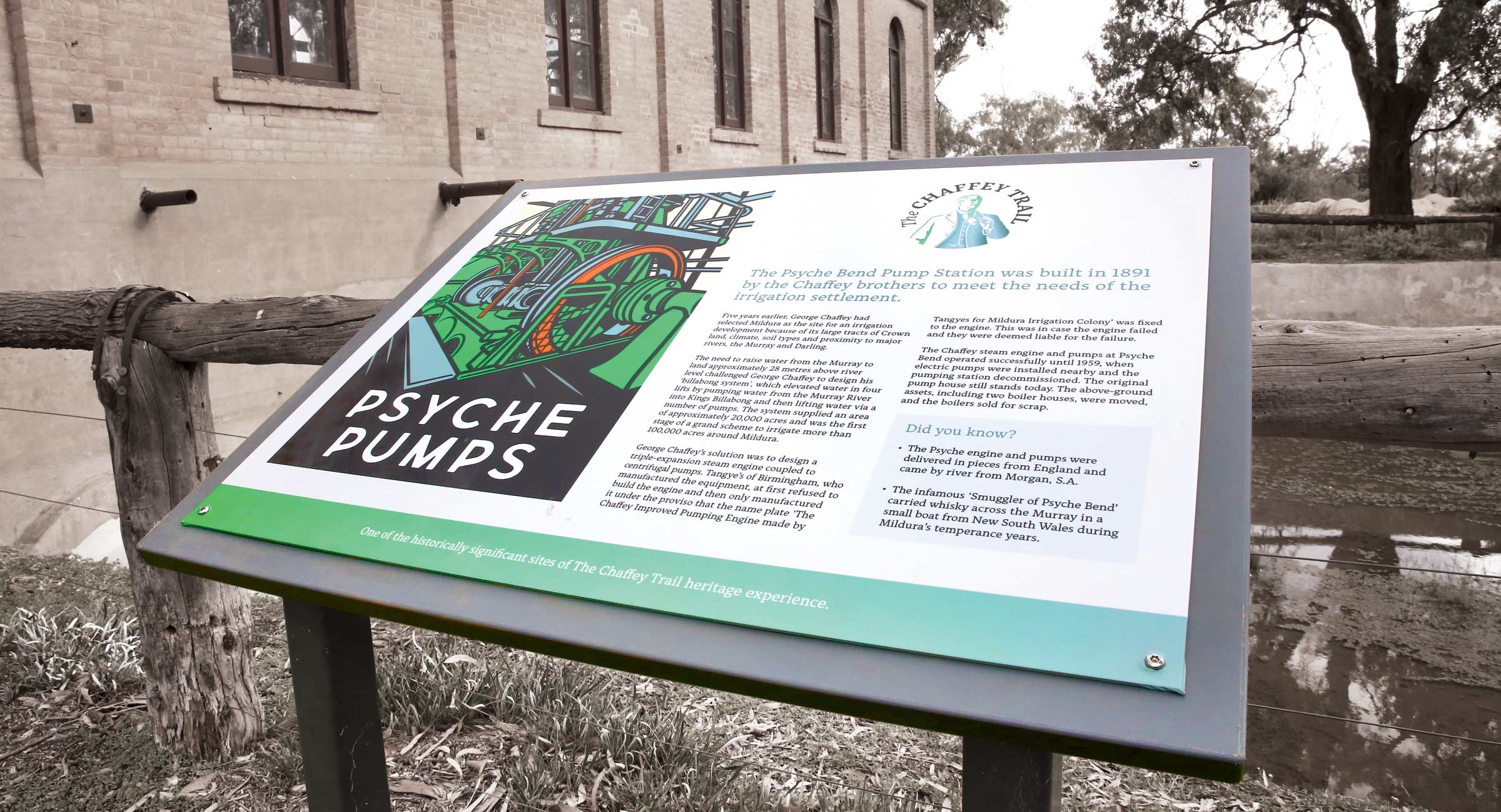
A strong and marketable brand for a heritage tourism trail with a rich local history

Mildura, Wentworth and Surrounds Official Visitor Guide design showcasing regional identity, attractions and events
A strategic healthcare and aged care brand transformation to help Country Care Group put the care back in our country

Establishment of a personal brand for a respected leader in the health and wellbeing industry

A strong and memorable self-storage sector brand for Storage Protect

A thoughtful rebrand to help multicultural communities 'rise higher'

Professional and cohesive financial services branding for a trusted accounting and financial advisory firm

Prominent corporate branding helping to build trust and a loyal customer base for a respected grain brokerage firm

Editorial book design capturing a unique and rich history of local heritage, spirit, and culture

Branding and packaging design for Australia's only naturally pink salt
Brand management for a national agribusiness

Strategic brand revitalisation for a regional Victorian community leadership program
Fresh and unique hospitality brand design for one of the longest established cafes in Bendigo, Victoria
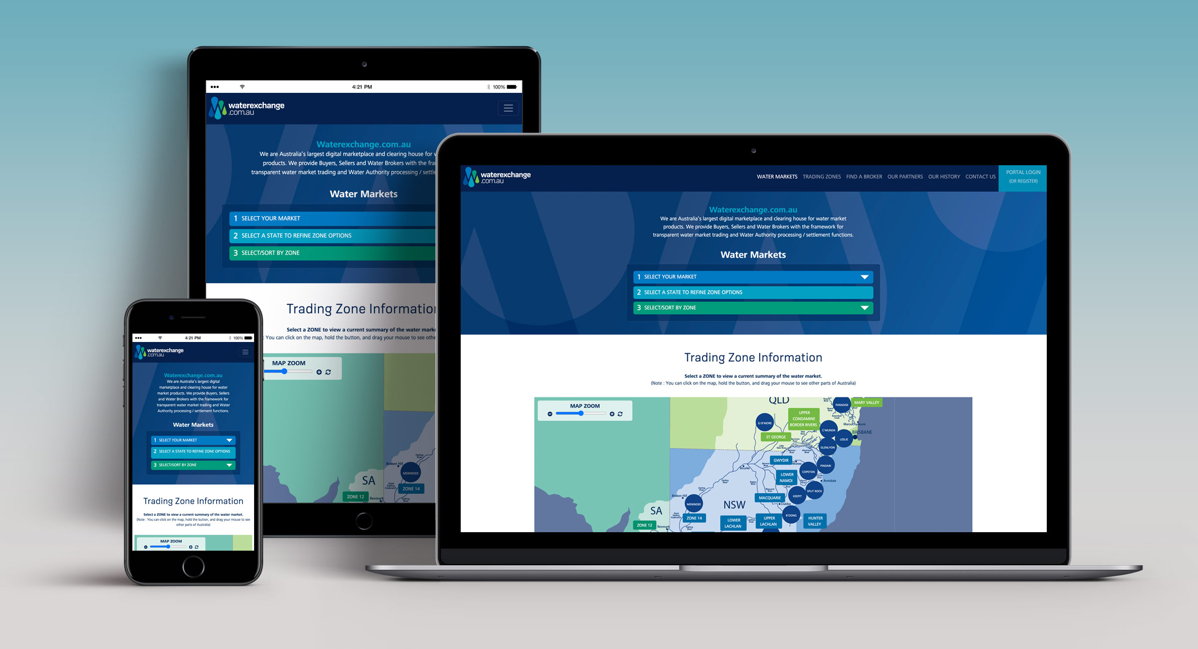
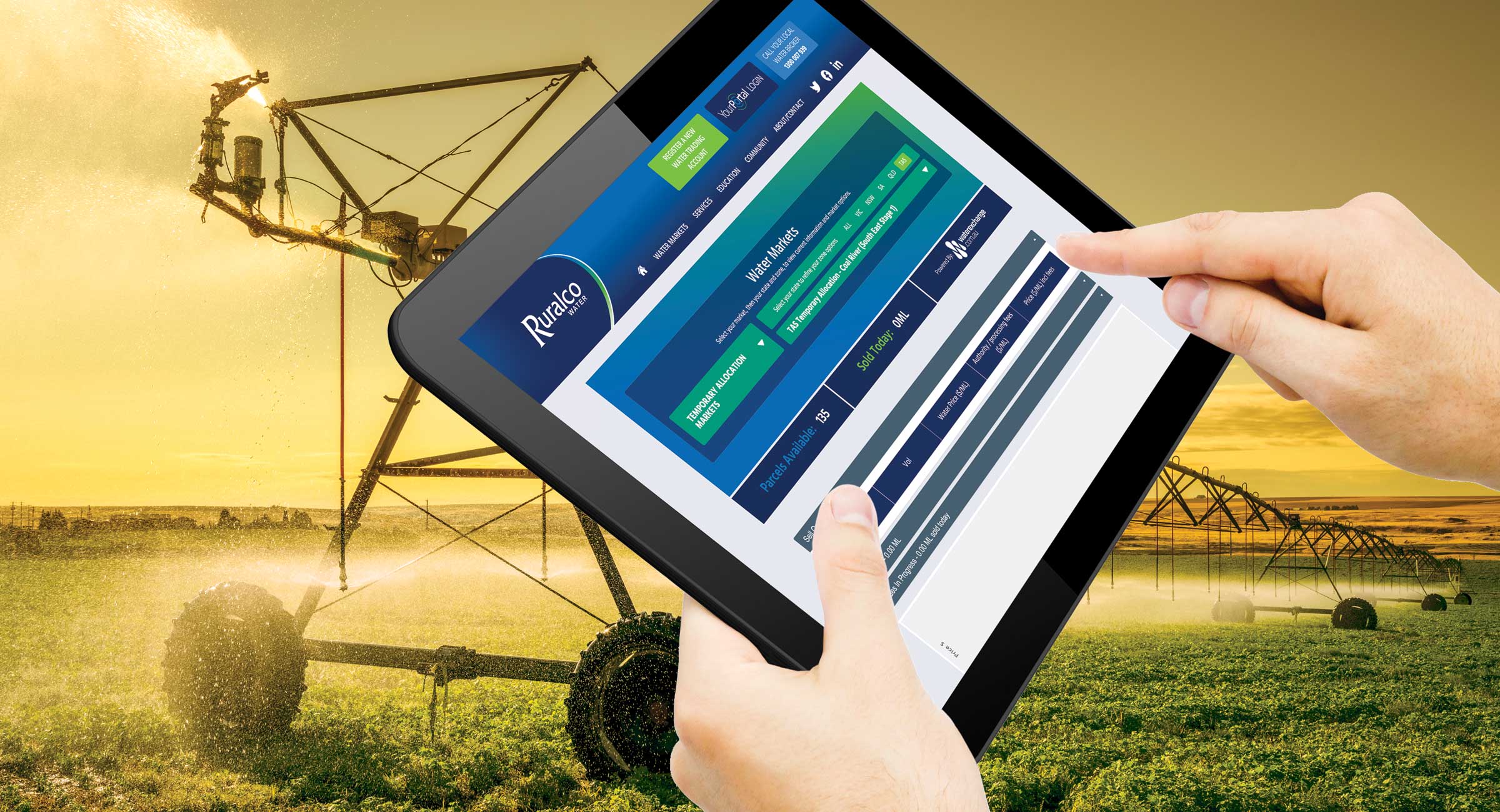
Refreshed water marketplace branding for Waterexchange.com.au

Branding that's creating a buzz for a small family business
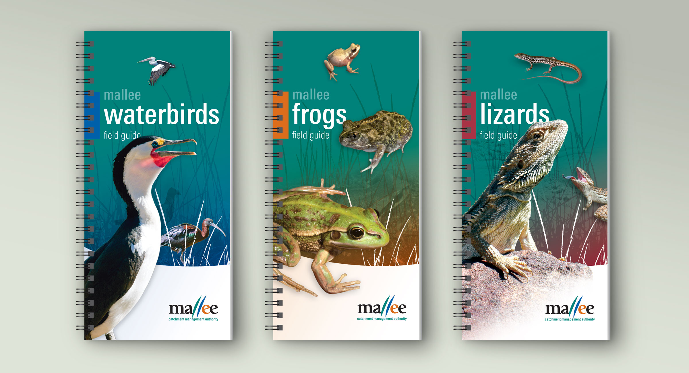
Environmental publication design for a series of educational field guides
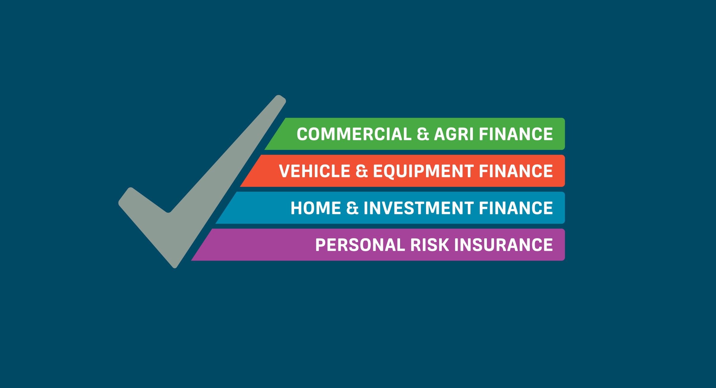
Strategic and memorable financial sector branding creating impact for an independent finance broker
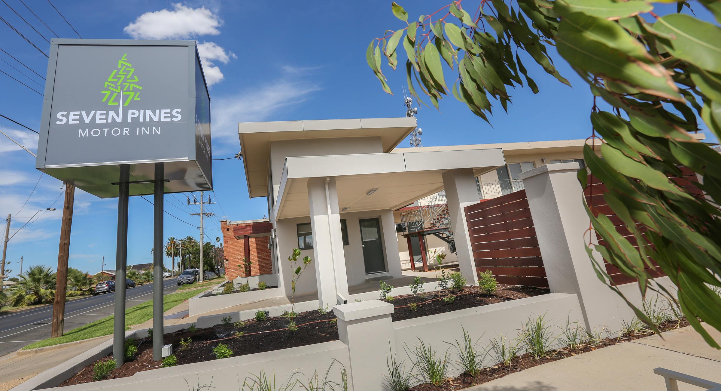
Modern and memorable branding for a small boutique accommodation business in Mildura's hospitality sector
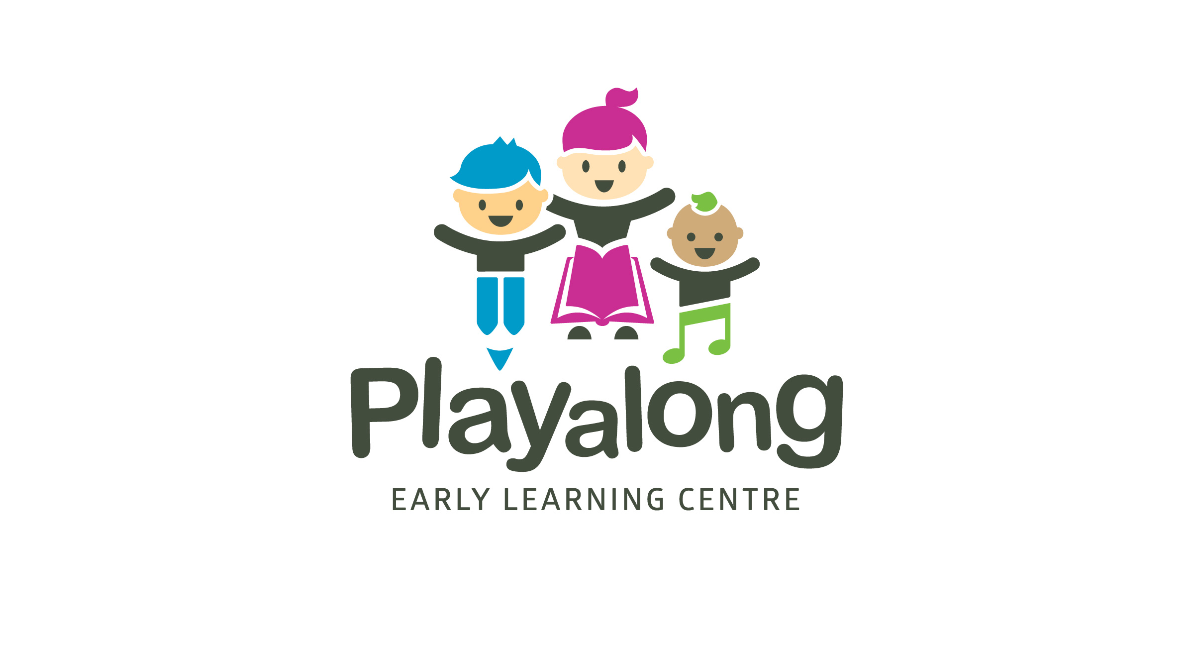
A playful and engaging brand identity for an early learning centre in the education sector
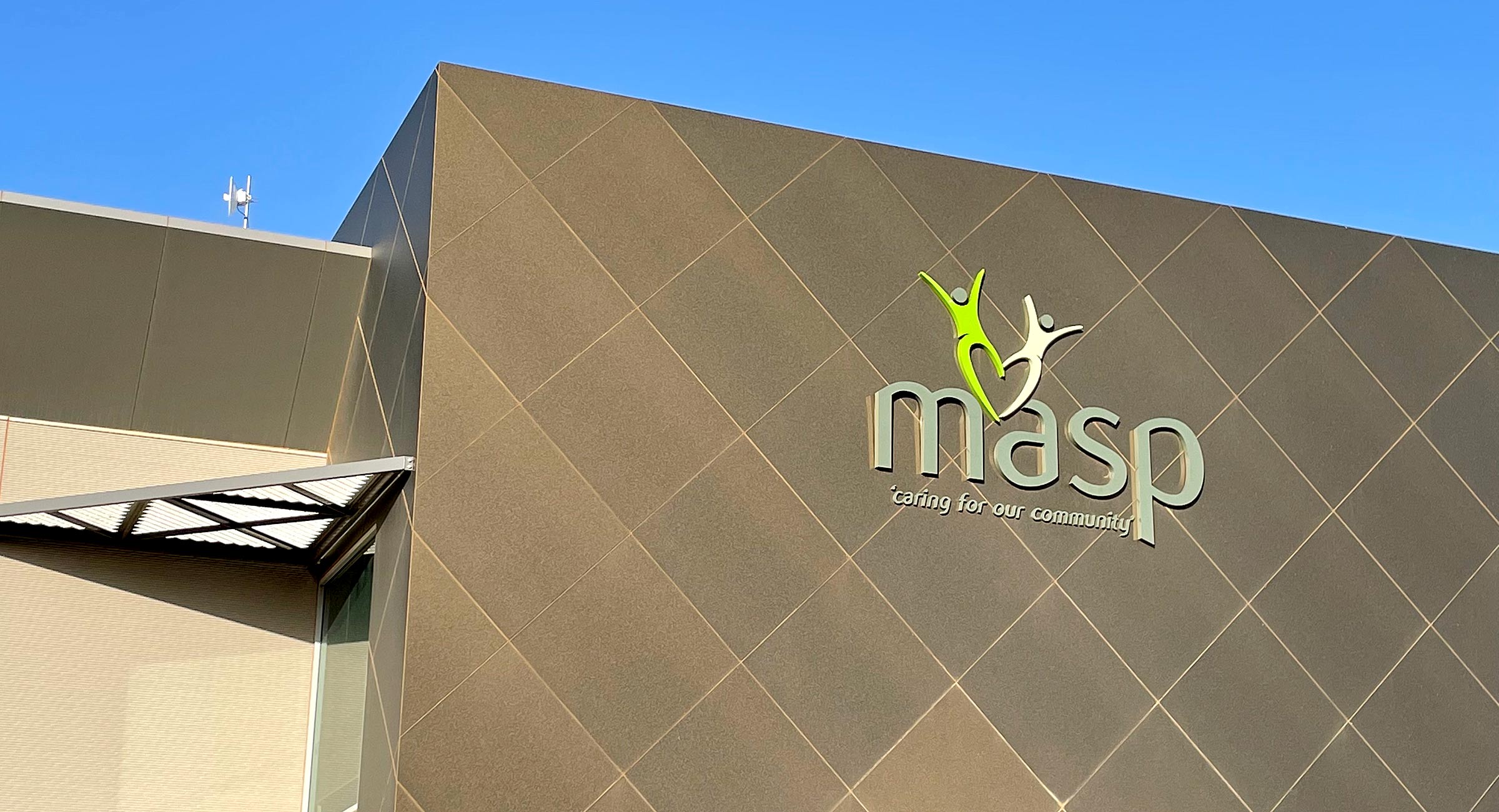
Purpose-driven brand identity design for a not-for-profit community support agency

Fresh produce branding and product photography for Mildura Fruit Company
A key publication design highlighting important community environmental achievements
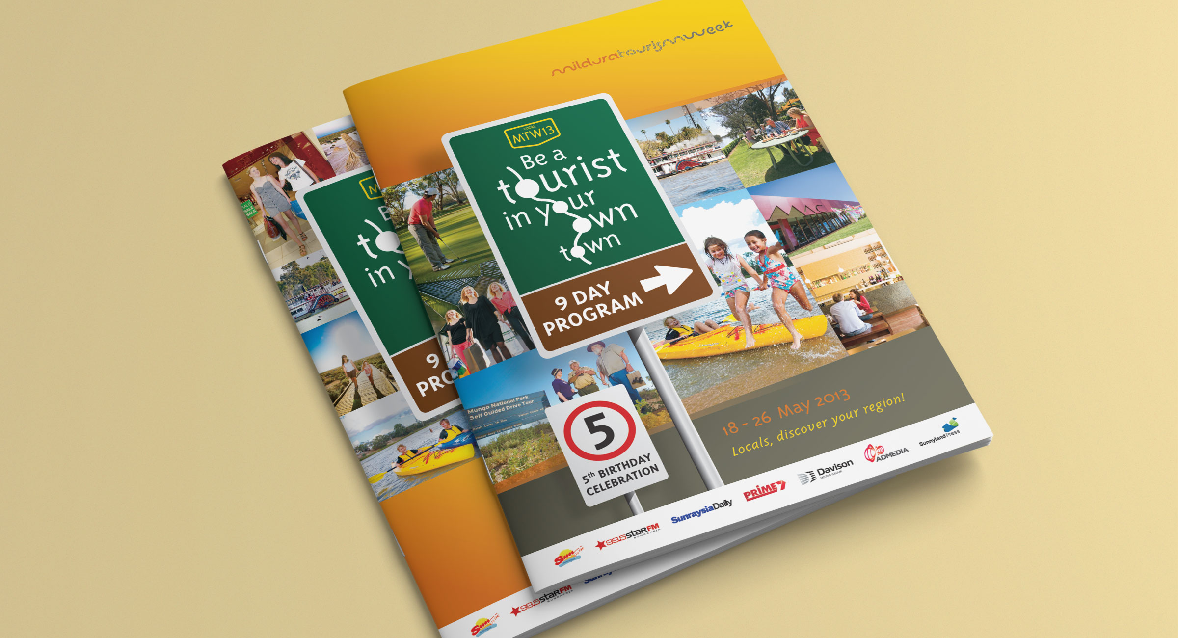
Strategic tourism campaign branding encouraging locals to rediscover their region
If your brand isn’t delivering meaning, impact, and growth then reach out!


